Designing for Inclusivity: Using Visual Aids to Improve Data Collection
As a UX designer, I am constantly seeking ways to ensure that surveys are inclusive and user-friendly for respondents from all backgrounds, particularly those with low literacy levels. In this article, I want to explore alternative methods of emotion representation in surveys, inspired by my African background and the communicative power of visual elements.
- Challenges and Considerations: While leveraging visuals in survey design presents promising possibilities, it is crucial to acknowledge and address certain challenges. Ensuring that the selected visuals accurately convey emotions universally and are widely understood across cultures is of utmost importance. Furthermore, maintaining the integrity and validity of the collected data is a critical consideration.
- Visual Approaches in Survey Design: Bridging Language and Emotion: One significant concern raised in survey design is the potential lack of understanding among respondents regarding the range of emotions depicted on Likert scales, especially in areas with low literacy rates. To tackle this challenge and improve inclusivity, let’s explore alternative methods of emotion representation inspired by my African background and the communicative power of visual aids.
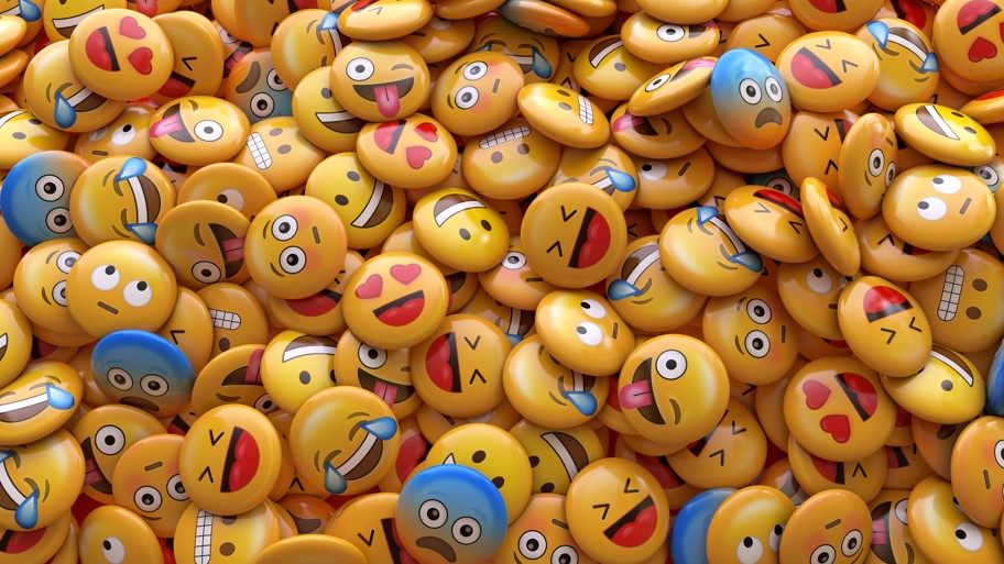
- Embracing Visual Communication: By incorporating memes, emojis, and static pictures, we can bridge the gap between language and emotion in survey design. Visual aids provide respondents with a more intuitive and accessible means of expressing their feelings. These elements not only transcend language barriers but also infuse an element of delight and engagement into the survey experience.
- Ensuring Universality and Cultural Sensitivity: To maintain the integrity of data collected, it is crucial to ensure that the selected visual aids accurately convey emotions universally and are widely understood across cultures. Conduct thorough research and testing to validate the effectiveness and cultural relevance of the chosen visuals. This ensures that respondents from diverse backgrounds can effectively convey their emotions without misinterpretation.
- Designing for Accessibility and Inclusivity: As UX designers, our primary responsibility is to craft experiences that are inclusive and user-centered. By reimagining traditional survey methods and embracing visual representation of emotions, we can create survey designs that cater to the diverse needs of respondents, regardless of their literacy levels or cultural backgrounds. This commitment to accessibility contributes to the production of more accurate and meaningful data, empowering organizations to make informed decisions.
- Promoting User Engagement and Response Rates: Incorporating visual elements into survey design has the potential to increase response rates and enhance the quality of data collected. Visual aids create a more engaging and interactive survey experience, encouraging respondents to participate and provide thoughtful responses. This, in turn, leads to a richer dataset and more reliable insights.
Incorporating visuals, such as memes, emojis, and static pictures, into survey design holds tremendous potential for improving accessibility and accuracy of data collection. By leveraging the power of visual communication, we can overcome language barriers and ensure that respondents with varying literacy levels can effectively convey their emotions. As UX designers, it is essential for us to embrace these alternative approaches and continue to push the boundaries of survey design to create inclusive and impactful experiences.
Remember, designing for inclusivity goes beyond language—it’s about creating a space where every voice is heard and understood. Let’s harness the power of visual aids to bridge language and emotion, paving the way for more inclusive and meaningful survey experiences. Together, we can make a difference.


